Responsive web design (RWD) is a web development strategy that makes dynamic changes to the look of a website based on the display size and orientation of the platform.
Defining the Concept of Responsive Web Design
Responsive web design (RWD) is a web development strategy that makes dynamic changes to the look of a website based on the display size and orientation of the platform. RWD is one solution to the challenge of developing for the wide variety of devices accessible to clients. This ranges from little phones to large desktop displays, and it is becoming more popular.
Breakpoints
Responsive web design uses breakpoints to specify how the layout of a website appears. Breakpoint uses one theme, while another design occurs below that breakpoint. The breadth of the window determines the breakpoints.
All devices use the same HTML, with CSS (which governs the layout of the site) customizing the look of the page on each device. Instead of establishing a separate site and associated codebase for wide-screen displays, workstations, laptops, iPads, and smartphones of various sizes, a single codebase can serve users with a variety of different-sized viewports, saving time and money.
Viewport
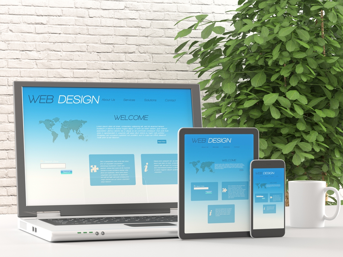
When the viewport expands or shrinks, the page components reorganize to accommodate the new size of the viewport. In the case of tablets, a three-column desktop arrangement reduces to two sections. In the case of smartphones to one column. When it comes to rearranging information and design components, the responsive design depends on proportion-based grids. However, while responsive design developed as a means of providing better access to information irrespective of the device, it is also possible to block certain items on smaller screens. For example, background images or additional navigation. Take users and their requirements into consideration when making decisions about concealing information and functionality.
Codebase
RWD has the potential to be more advantageous than designing separate sites for various kinds of devices. When opposed to constructing three or four unique sites, the usage of a single codebase may expedite the development and make maintenance simpler over time. Indeed, just one collection of code and material needs updating rather than three or four different sets.
Consider RWD “future-proof”, in the sense that it can accommodate any additional breakpoints required in the future. If a 5-inch device or a 15-inch device becomes common in the market, the new device accommodates the software on the new devices. A responsive web design approach does not bind design to a certain device.
In order for items to be able to scale and rearrange, it is frequently simpler to develop a responsive web design on a site that is more concerned with content than with operations. While maintaining clarity and usefulness, it may be difficult to fit complex information or interactions into modular components that can be easily shuffled about a page while maintaining clarity and performance.
Developing Usable User Interfaces for Responsive Web Design

Because responsive design depends on moving items across the page, designers and developers must collaborate closely. Thus, creating a consistent user experience across all platforms and devices. It is not uncommon for responsive design to resemble a puzzle, with items on bigger pages having to be rearranged to fit on skinnier, longer pages, or vice versa. However, guaranteeing that items fit inside the confines of a page is not sufficient. In order for a responsive design to be effective, the layout must also be useable across screen sizes.
When items move around on a website, the customer experience might be very different from one visit to the next. Design and development teams must collaborate in order to identify how the material should shift. Then, they can understand what the final effect of that shift looks like and how it impacts the customer experience.
Many design teams rely on popular adaptable frameworks, such as Bootstrap, to assist them in the creation of their designs. Frameworks of this kind may be quite beneficial in the development process. Carefully evaluate how the foundation engages with the content and performance of your site.
We usually propose that designers do usability testing on their designs. We propose a test for responsive designs across a variety of platforms. It’s difficult enough to create a website that is functional on a desktop computer these days. The task of designing a website that is functional in a variety of reconfigurations or combinations of its pieces, across a range of screen sizes and orientations, is considerably more difficult. In certain cases, a design feature that works well on a desktop computer may perform badly on a smartphone.
Concentrating on the Content
One of the most important aspects of executing responsive design successfully is content prioritization. When viewing material on a big desktop display rather than a tiny smartphone screen, users see far more content. If people use a desktop computer and do not immediately see what they are looking for, they may quickly navigate around the website. When using a smartphone, consumers may have to browse endlessly to find the material. Smart content prioritizing aids consumers in finding what they are looking for more quickly.
When it comes to responsive design, performance might be a concern. Every device that receives responsive web design receives the identical code, regardless of whether or not the code pertains to that particular design. Changes to the design are made on the client-side, which means that each device — whether it is a phone, a tablet, or a computer — gets the complete code for all platforms and only uses what it requires.
The same code is sent to a 4-inch smartphone as it is to a 24-inch desktop display. Because smartphones are often used with slower and more intermittent data connections, this might cause performance to suffer. In order to address this issue, some websites use adaptive design. In this case, the website’s server recognizes the device making the request. Then, it provides various batches of HTML code depending on that device.
Learn More About Responsive Web Design
It is not sufficient to test responsive designs simply in the comfort of your own work on your high-speed connection in order to accurately analyze the user experience provided by a responsive design. Take your smartphone out into the wild. Go between high rise buildings in a city, in interior meeting rooms, in isolated places. Then, see how your site performs under a variety of conditions and environments. Many adaptable designs are created with the purpose of providing better access to information irrespective of the device being used. If downloading times are too long, a smartphone user will not have an experience comparable to a desktop computer user.
The bottom line is that responsive design is a resource, not a miracle. While employing responsive design has numerous advantages when developing for a variety of devices, the method does not guarantee a usable experience on all of them. Teams must pay close attention to the fine elements of information, style, and results in order to provide a seamless user experience across all devices.