
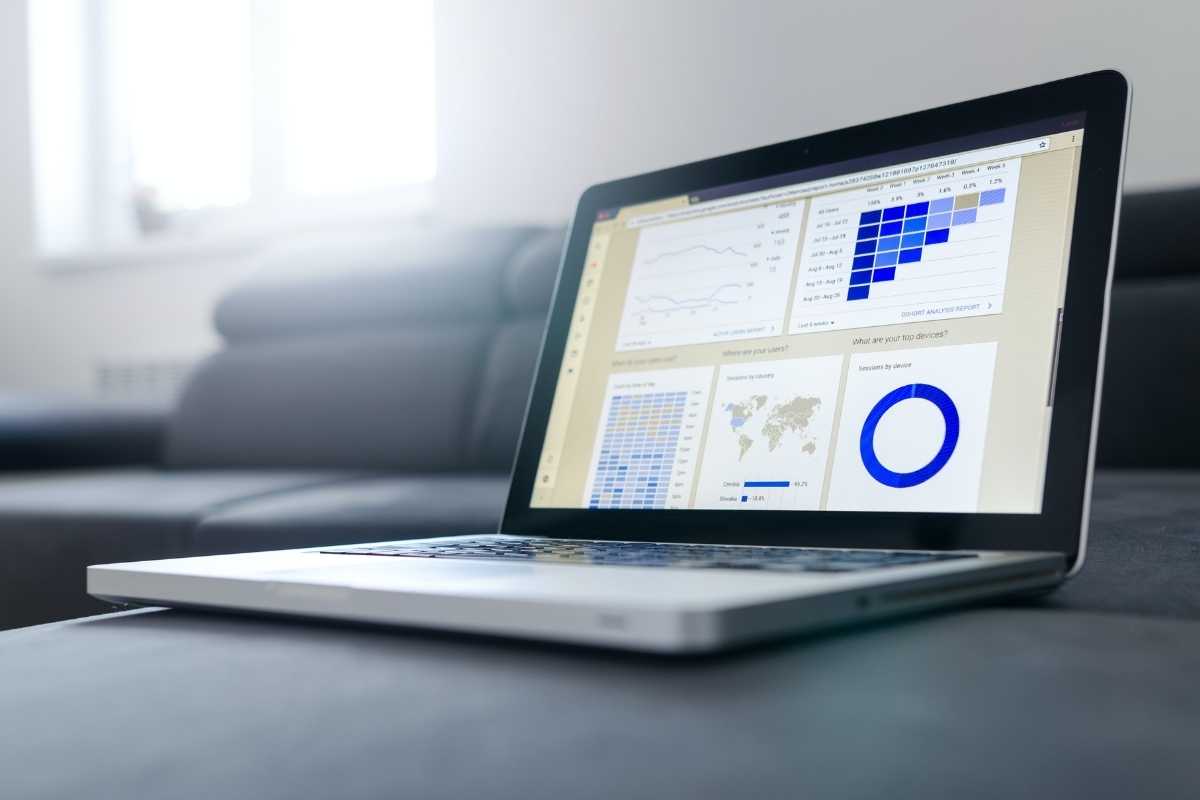
Data scientists spend a lot of time analyzing data and determining important trends and patterns that can impact a company’s future. However, explaining these trends and patterns — and presenting them to leaders in a company — can be challenging.
This is where data visualization comes in. Data visualization is utilized in many ways when it comes to data analysis. Through the creation of graphics like charts or maps, these visuals easily present and communicate valuable information.
Role of Data Visualization
Data visualization is incredibly valuable in data science, serving as an essential tool for several stages of data analysis.
For instance, data visualization allows an individual to create visuals that can be insightful during the discovery phase of data analysis. Data scientists have to look at significant amounts of data and finding patterns and trends can be difficult. By using a graph or chart, one can find random values in the data. It can also confirm hypotheses and help explain correlations in data.
Data visualization can also be a form of communicating findings to business leaders or stakeholders. Since these problems can impact future decisions in a company, data findings must be presented clearly — if they can see it, they can believe the patterns are present.
Data visualization also serves as one of the best ways to communicate information to just about any person in any field. You don’t need a master’s degree in computer science or mathematics to understand a chart, so it can be incorporated into any project that includes results with data.
That being said, data visualization cannot be used as the only way of communicating results. Patterns and trends in data visualization can be deceiving because they do not provide the full context of a problem. Those that use it, therefore, have the responsibility of making sure that they recognize potential biases in results and provide context when necessary.
Types of Data Visualization
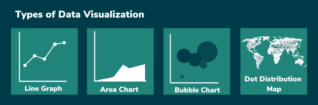
Data visualization isn’t as simple as plotting data into a graph and calling it a day. For data to be incorporated correctly, the right chart or map must be used. Here are a few examples of graphs and charts and why they are commonly used.
Line Graph: A line graph or line chart shows changes that occur over time. If the data isn’t presented in a straight line, then a line graph can easily include markers to indicate dips or spikes that have occurred.
Area Chart: An area chart is ideal for measuring changes in volume over time. It is similar to a line graph because it plots data and connects it through a line segment. However, the space between the line segment and the x-axis will need to be filled in to indicate if volume decreased or increased over time.
Bubble Chart: A bubble chart can be used to show the relationship between several variables as they change over time. A bubble chart will have circles of different sizes, dictated by a third variable that will usually show volume.
Dot Distribution Map: A dot distribution map is a map that shows how data is distributed according to a geographic location. These maps will usually indicate spatial patterns or show spaces in density over a geographic location.
Data Visualization Software
Software is also important for creating data visuals. Certain job positions will require knowledge of a specific software program. Here are a few examples of the most popular data visualization software programs.
Tableau. Tableau is one of the most popular and widely-used interactive software programs for data visualization, used by Whole Foods, Nissan, and NYC Health + Hospitals. The software program does not involve coding and is compatible with many data sources.
FusionCharts. FusionCharts is a data visualization program that is commonly used by data scientists who are comfortable with JavaScript. This software includes popular JavaScript libraries to provide ease of use. FusionCharts is commonly used among many top technology companies, such as Google, IBM, and Facebook.
Sisense. Sisense is a user-friendly analytics platform with AI technology. It can be used by non-experienced coders as well as experts. Sisense has commonly been used by companies such as Verizon Wireless, G.E., and Motorola.
Data Visualization in Today’s World
Data visualization has become a powerful way of spreading information in today’s world. For instance, when the World Health Organization stated that the COVID-19 outbreak was a global pandemic back in March 2020, tracking the number of cases became vital to limiting the spread and creating national and state policies.
Area charts, dot distribution maps, and more have served as a significant way of tracking this data and monitoring the severity of the spread. The Center for Disease Control has also made these visuals easily accessible to the public to provide irrefutable evidence for why certain guidelines have been implemented.
Data visualization is important because it can explain data patterns and trends in a way that anyone can understand. However, to be used properly, data visualization requires an objective mind and a keen understanding of which visual to use.
Data drives the future. As a data scientist, you’ll harness the power of applied mathematics and computer science to glean valuable business insights from even the most unwieldy of data sets and then use data visualization to explain it to others. Learn more about how WOZ curriculum can prepare you for a career in Big Data.

Sophia Acevedo
Sophia Acevedo is a journalist based in Southern California. She is a 2020 graduate from California State University, Fullerton, and a proud Daily Titan alum.